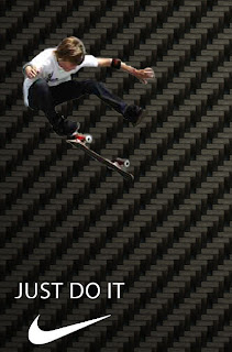
 Edit on photoshop for a nike advert. This image has 3 main elements; the skater, the logo and the background. If i were to re do this photo i would spend more time editing the skater so that it blends in better with the background and use a rubber tool to get rid out the white edge around him, altough you can not see it that well on the small image, but is very notisble on a large image.
No comments:
Post a Comment